CSSS 2010 Santa Fe-TShirts: Difference between revisions
From Santa Fe Institute Events Wiki
No edit summary |
No edit summary |
||
| Line 33: | Line 33: | ||
[[Erik Van den broecke]] | [[Erik Van den broecke]] | ||
==Attractive T-Shirt== | ==Attractive T-Shirt== | ||
| Line 47: | Line 42: | ||
Just a basic idea - could change some of the words (ie- "I was here." or say somewhere "who knows where we'll go next"). Could have the SFI logo on the back. | Just a basic idea - could change some of the words (ie- "I was here." or say somewhere "who knows where we'll go next"). Could have the SFI logo on the back. | ||
Note: I have seen a shirt like this with 'Strangely Attractive' ([[Borys Wrobel]]). | Note: I have seen a shirt like this with 'Strangely Attractive' ([[Borys Wrobel]]). | ||
==Petroglyphs== | |||
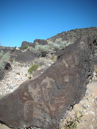
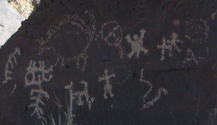
White on black? [[http://www.nps.gov/petr/index.htm Petroglyph]] National Monument is not far from here... Here's some pix I took last Saturday ([[Borys Wrobel]]).<br> | |||
[[Image:petroglyph1.jpg |left|340 px]][[Image:petroglyph2.jpg|left|250 px]]<br> | |||
[[Image:petroglyph3.jpg|left|440 px]]<br> | |||
<br><br><br><br><br><br><br><br><br><br><br><br><br><br><br><br> | |||
Revision as of 21:29, 11 June 2010
| CSSS Santa Fe 2010 |
Please submit t-shirt design ideas here. Voting will take before lectures on Monday June 14.
Remember: T-shirt designs will be on solid black this year.
XKCD-like
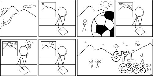
This is just a random, silly idea I had, based off xkcd - if you're not familiar, here's a good one (the most recent is a bit inappropriate). This can totally be modified if folks have ideas/suggestions. I was thinking this could go on the front (in white? blue?) and the SFI logo on the back, upper center. Kyla Dahlin
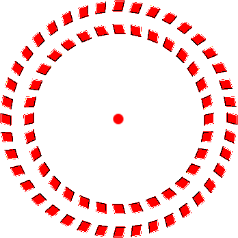
Optical Illusion
Justice League
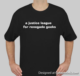
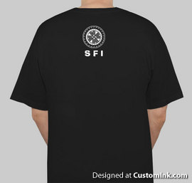
I chuckled when Dan mentioned that Rolling Stone magazine had called SFI "a justice league for renegade geeks." I didn't get a chance to see the old designs, so I don't know if this has been done before, but I think we could run with that idea. I don't have much graphic design experience, but it could be as simple as having those 6 words in an interesting typefont on the front and the SFI logo on the back or vice versa?
We could toy with cartoons that use this idea, as well. The Superman logo/theme comes to mind. Anyone have any thoughts?
-- I love the idea. :) And, yeah, it could be as simple as having those 6 words. - Erika Fille Legara
--Here is a mockup, very very rough, but it gives you a general idea. If anyone has more design experience I'd appreciate help!
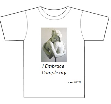
Embracing Complexity
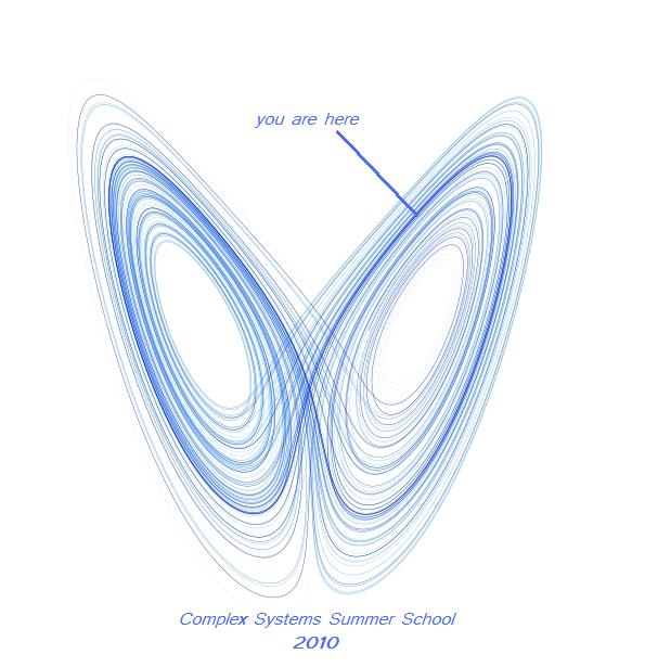
Attractive T-Shirt
Just a basic idea - could change some of the words (ie- "I was here." or say somewhere "who knows where we'll go next"). Could have the SFI logo on the back. Note: I have seen a shirt like this with 'Strangely Attractive' (Borys Wrobel).
Petroglyphs
White on black? [Petroglyph] National Monument is not far from here... Here's some pix I took last Saturday (Borys Wrobel).
