CSSS 2007 Santa Fe-T-shirts: Difference between revisions
From Santa Fe Institute Events Wiki
| Line 18: | Line 18: | ||
<br><br> | <br><br> | ||
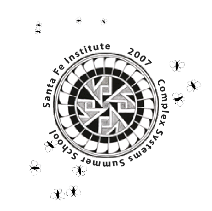
== | == Original logo with fire flies == | ||
[[Image:logo6.gif]] | [[Image:logo6.gif]] | ||
Revision as of 08:11, 12 June 2007
| CSSS Santa Fe 2007 |
Throughput

This is GREAT ! (Saleha)
If we use this for the back, then we should probably remove the "Complex Systems Summer School" lettering since that would on the logo on the front. -Will B.
Ants on a page (for the back?)
This is a picture of a real ant that visited us in the cafe late Monday night while we were working on the t-shirt design. (And yes, the ant was at least that big.) --Will B.
NetLogo pic: pref attach (for the back?)
NetLogo pic: flocking (for the back?)
Original logo with fire flies
Logos with ball bearings (and some fire flies)
Logo on steroids v1
Logo on steroids v2
Bad logos
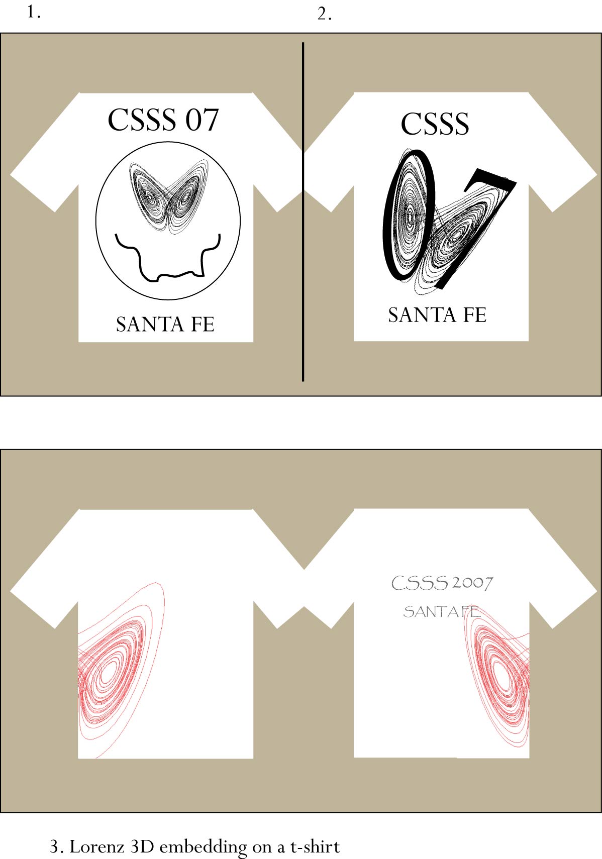
Designs prior to Monday night
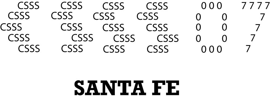
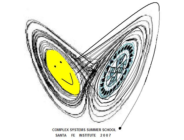
I like both 1 and 2 - The Lorentz Eyes! I would reverse the lettering and put SFI (not SF) at the top. (See below.) Who is the artist? How do you figure that out from the Wiki? Joe DeRosa
       * Santa Fe Institute
       * Then the drawing
       * CSSS
I liked the T shirt with the Santa Fe Institute ( 'being eaten by ants' ) on it. Saleha Habibullah
Yeah, the ants were cool. If for some reason we are not allowed to reuse past designs, I think it's a good idea to incorporate the SFI logo into the design. Will Braynen.
Doesnt it seem that the 3 S's in CSSS can make for a nice DNA spiral? though that may be an often used idea!
I like the design which combine 2 and 3.
Hi all, here are some crude suggestions about the t-shirt design: variations on the Lorenz (and soccer ;), Fractal and Santa Fe subjects...
___________________________________________________________________________________________________________________________
___________________________________________________________________________________________________________________________
___________________________________________________________________________________________________________________________
I like design no.2( Saleha )
Hello,
I wanted to add one more to the cool T-shirt designs, but I am not too good at computer graphics design.
Could anyone help?
Spyro
___________________________________________________________________________________________________________________________
Obviously a real rough sketch. From Codex Vindobonensis 2554 (French, ca. 1250), in the Österreichische Nationalbibliothek [1]. (Paul H.)
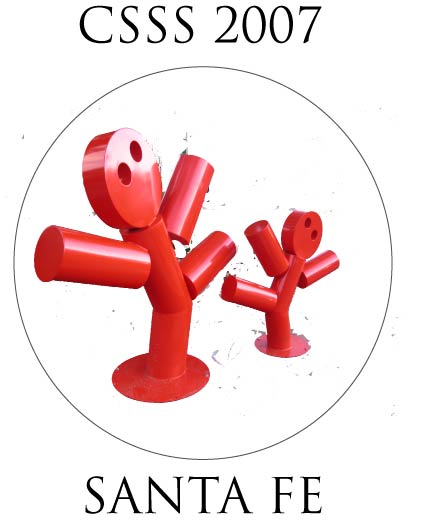
A very rough sketch (non-existent graphic design skills!), but I hope you get the idea. Can also work monochromatically. Spyro
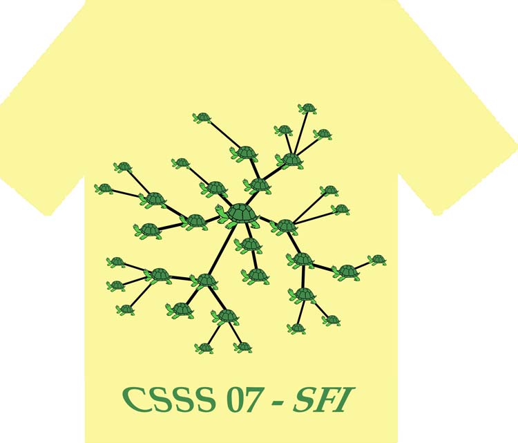
The turtle net. Yossi


