CSSS 2007 Santa Fe-T-shirts: Difference between revisions
From Santa Fe Institute Events Wiki
No edit summary |
No edit summary |
||
| Line 30: | Line 30: | ||
I like design no.2( Saleha ) | I like design no.2( Saleha ) | ||
___________________________________________________________________________________________________________________________ | |||
Hello, | Hello, | ||
| Line 38: | Line 37: | ||
Spyro | Spyro | ||
___________________________________________________________________________________________________________________________ | |||
[[Image:hoopstshirt.jpg]] | |||
Revision as of 18:38, 9 June 2007
| CSSS Santa Fe 2007 |
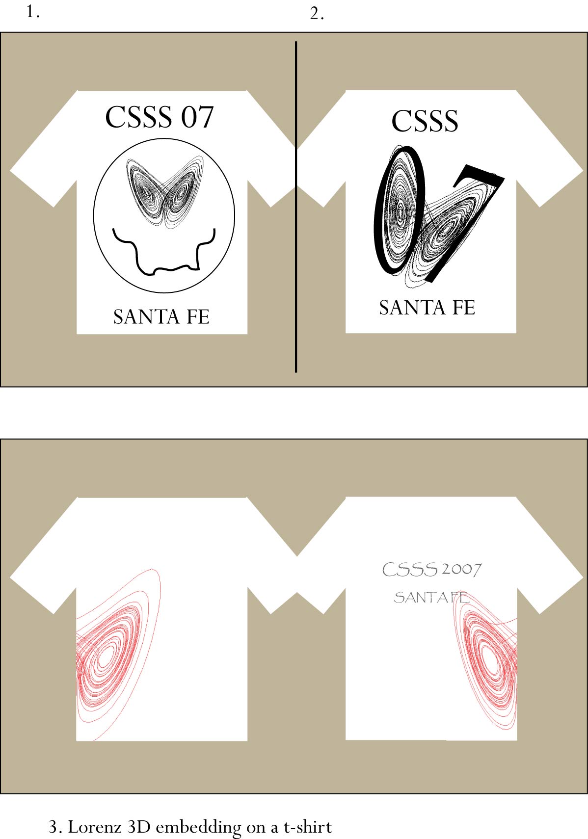
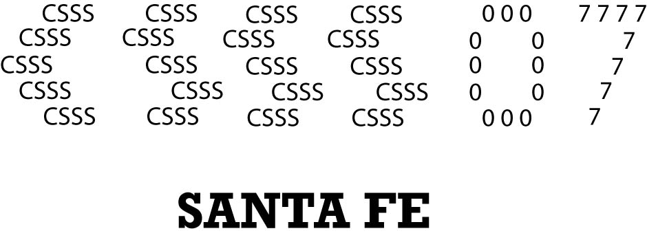
I like both 1 and 2 - The Lorentz Eyes! I would reverse the lettering and put SFI (not SF) at the top. (See below.) Who is the artist? How do you figure that out from the Wiki? Joe DeRosa
       * Santa Fe Institute
       * Then the drawing
       * CSSS
I liked the T shirt with the Santa Fe Institute ( 'being eaten by ants' ) on it. Saleha Habibullah
Doesnt it seem that the 3 S's in CSSS can make for a nice DNA spiral? though that may be an often used idea!
I like the design which combine 2 and 3.
Hi all, here are some crude suggestions about the t-shirt design: variations on the Lorenz (and soccer ;), Fractal and Santa Fe subjects...
___________________________________________________________________________________________________________________________
___________________________________________________________________________________________________________________________
I like design no.2( Saleha )
___________________________________________________________________________________________________________________________
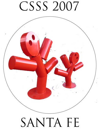
Hello, I wanted to add one more to the cool T-shirt designs, but I am not too good at computer graphics design. Could anyone help?
Spyro
___________________________________________________________________________________________________________________________


