CSSS 2009 Santa Fe-TShirts: Difference between revisions
From Santa Fe Institute Events Wiki
| Line 30: | Line 30: | ||
* [[watson]]: R, I like the design. I think it would still look good with posterized v2. What would you think about centering the front logo instead of putting it in the upper left of the shirt? I feel like shirts with upper left logos feel more official/formal and less artistic... but perhaps that is just my own bias. | * [[watson]]: R, I like the design. I think it would still look good with posterized v2. What would you think about centering the front logo instead of putting it in the upper left of the shirt? I feel like shirts with upper left logos feel more official/formal and less artistic... but perhaps that is just my own bias. | ||
** I'm leaning off-center b/c I sorta feel that with a centered design, it's a little more awkward for both reader & wearer when the wearer's a woman. But I do see what you're saying.... ultimately I'm ok with either; whatever the crowd wants is fine by me. | |||
==Petroglyphs== | ==Petroglyphs== | ||
Revision as of 19:15, 15 June 2009
| CSSS Santa Fe 2009 |
If you have free time, you may design a t-shirt and submit photos of ideas here. We will vote on the best/favorite T-shirt design and then (hopefully) have them made at the end of the school.
Logistic Martini
My idea is to use a logisticmap bifurcation diagram as a martini glass. It could show a person drinking from it like the Coca-Cola ads.
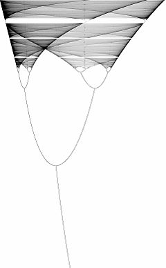
I like the above idea but would also add this alternative: turn the bifurcation diagram upside down to look like mountains, much like the local terrain.
Logistic Mountain
Ooh! I like that suggestion, Erin, so I tried to implement it w/ the SFI logo as a setting sun, like this:
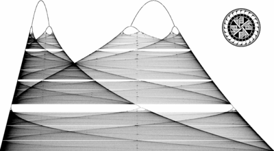

- Roozbeh Daneshvar: I really like this one! I can also give you a high quality SFI logo with my thumb drive.
- I'll take you up on this! Monday during the first break? -Rosemary Braun
- B/c I was concerned how the shading will turn out on a t-shirt, I made a few posterized versions that could be more easily screenprinted in two colors. I've tried to retain the essential features, but admittedly it loses some beauty. Thoughts?
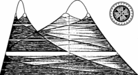
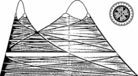

- watson: R, I like the design. I think it would still look good with posterized v2. What would you think about centering the front logo instead of putting it in the upper left of the shirt? I feel like shirts with upper left logos feel more official/formal and less artistic... but perhaps that is just my own bias.
- I'm leaning off-center b/c I sorta feel that with a centered design, it's a little more awkward for both reader & wearer when the wearer's a woman. But I do see what you're saying.... ultimately I'm ok with either; whatever the crowd wants is fine by me.
Petroglyphs
A indigenous-themed design based on the Jornada Mogollon petroglyphs at the Three Rivers site. I assume their copyright has expired. I strongly recommend this place for a visit, as it is not far from Santa Fe. Suggestions welcome.

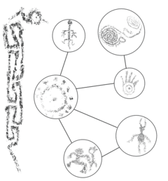
Similar patterns in different scales
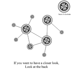
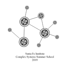
The idea of this design is to show that the same patterns appear in different scales (by the way, the two images are topologically similar). The resolutions of these files have been decreased, so that I can upload them easily. By the way, I have a high resolution image of SFI logo. It is about 8 Mega Bytes and I can not upload it here. If you need it, please let me know. --Roozbeh
White Sands Sunrise
The concept behind this design is celebration of simplicity, natural beauty, emergent complexity, and our attempts to model and understand all of it. Most of us are aware of the idea of a sand pile as a complex system. Depending on the state of the sand below and above it a piece will either slide further down the pile or stay put. Simple rules can start to give rise to interesting spatial patterns through time.
The sand pile then symbolizes a prototypical complex system found in nature which we can begin to recreate within simulations in our digital labs. The progressive pixelation from top to bottom in the sand is representative of our desire and practice simultaneously of magnification and abstraction of patterns and relationships.
The sun rising above the mountain in White Sands is homage to the primal source of energy that has fed Earth's biological evolution (and complexification) since the dawn of life, an acknowledgment of the blessing of endless nourishment bestowed into our physical existence daily. Simultaneously the halo of light around the sun is reminiscent of this area's atomic heritage and serves as a reminder of the power and responsibility that comes with creation and manipulation of our world as scientists and engineers.
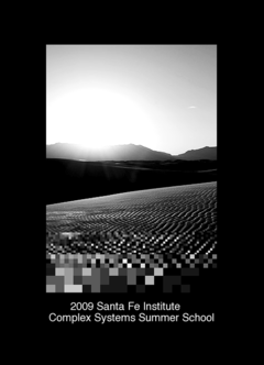
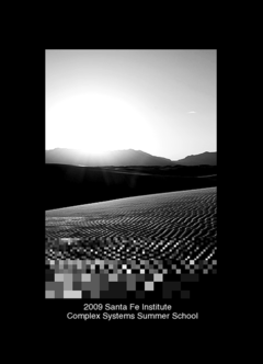
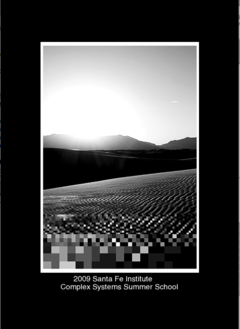
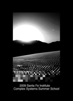
These are four different versions for the front. I'm partial to the last, but we can toy around with the exact configuration to get the font size and border (or lack thereof) just right. Keep in mind this would be about 4 inches across on the chest in the middle. Also this is a screen shot of my program. What is black is actually transparent, so we could print on whatever color.
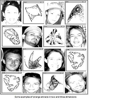
Strange Attractors
Terry Pratchett Quote
I love the artwork in some of the above designs, but found this quote we could possibly use....
its from Terry Pratchett's novel 'Witches abroad' (2002).
"people stopped building their rational sticks in the chaos of the universe and started getting interested in the chaos itself - partly because it was a lot easier to be an expert in chaos, but mostly because it made really good patterns that you could put on a t-shirt."
obviously its a little long, so could perhaps be adapted thus...
"Studying complexity at SFI... ... because it [makes] really good patterns that you [can] put on a t-shirt (terry pratchett, 2002)."
thoughts?
America's Next Top Agent-Based Model
I realize that some of the foreign students may not understand the cultural reference here but I find this joke of Karen's simply hilarious. So I decided to give it a chance. Milena Tsvetkova

Borromean Rings
Black T-shirt with the colorful/or white Borromean rings as symbol of unity and interconnection of scientific disciplines in the studies of complexity and our understanding of nature(and/or, if you wish, signifying the unity of the diverse backgrounds of the participants). The Borromean rings consist of three topological circles which are linked and form a Brunnian link, i.e., removing any ring results in two unlinked rings.
It's also possible to use ellipses- they look cooler.
PS. And also, looking at the Borromean rings makes me wonder if the knot theory could be used for the more advanced network analyses. That would be interesting. Lara

