Complex Systems Summer School 2013-TShirts: Difference between revisions
From Santa Fe Institute Events Wiki
No edit summary |
mNo edit summary |
||
| (7 intermediate revisions by 6 users not shown) | |||
| Line 33: | Line 33: | ||
----- | ----- | ||
[[File: | [[File:picklegrid_04.png|661px]] | ||
Never forget the [http://www.amazon.com/Accoutrements-11761-Yodelling-Pickle/dp/B0010VS078/ref=sr_1_1?s=toys-and-games&ie=UTF8&qid=1370726588&sr=1-1&keywords=yodeling+pickle yodelling pickle]. Never. | Never forget the [http://www.amazon.com/Accoutrements-11761-Yodelling-Pickle/dp/B0010VS078/ref=sr_1_1?s=toys-and-games&ie=UTF8&qid=1370726588&sr=1-1&keywords=yodeling+pickle yodelling pickle]. Never. | ||
| Line 47: | Line 47: | ||
----- | ----- | ||
[[File: | [[File:Csss_shirt_todd.jpeg|800px]] | ||
I thought it would be interesting to use something we learned in class for the T-shirt. I'm trying to use a genetic algorithm to evolve the SFI logo. On the back are population samples from various time steps. | I thought it would be interesting to use something we learned in class for the T-shirt. I'm trying to use a genetic algorithm to evolve the SFI logo. On the back are population samples from various time steps. | ||
| Line 66: | Line 65: | ||
'''The landscape are the mountains behind St.Johns, and the mandelbrot fractals are the clouds. I can make the landscape less detailed and more simple, uploads will follow - Susanne''' | '''The landscape are the mountains behind St.Johns, and the mandelbrot fractals are the clouds. I can make the landscape less detailed and more simple, uploads will follow - Susanne''' | ||
[[File:SFI t-shirt Mountains & Mandelbrot.png]] | [[File:SFI t-shirt Mountains & Mandelbrot.png|1200px]] | ||
| Line 96: | Line 95: | ||
Okay, I updated the shirt. The logo looks fuzzy in this version, but it will be slightly larger and crisper in the final. [[Nix_Barnett | Nix]] | Okay, I updated the shirt. The logo looks fuzzy in this version, but it will be slightly larger and crisper in the final. [[Nix_Barnett | Nix]] | ||
One final statement: The colors are negotiable, though I like light colors on black. Also, as I said before, I can load in text with a nice font, but I'll keep the "Pong" style font otherwise. The pixels could be made larger if you're concerned that it'll just look like a moldy shirt ;) --[[Nix_Barnett | Nix]] | |||
[[File:nix_shirt_2.jpg]] | [[File:nix_shirt_2.jpg]] | ||
| Line 120: | Line 121: | ||
This one really clicked with me immediately. I was expecting more "complex" designs, but I really love how simple and to the point it is. I wonder if we could maybe collaborate? I'd like to maybe design the back like I described earlier. Basically something like "SFI CSSS 2013" and the SFI logo, with Conway's Game of Life growing from the letters and logo... [[Nix_Barnett| Nix]] | This one really clicked with me immediately. I was expecting more "complex" designs, but I really love how simple and to the point it is. I wonder if we could maybe collaborate? I'd like to maybe design the back like I described earlier. Basically something like "SFI CSSS 2013" and the SFI logo, with Conway's Game of Life growing from the letters and logo... [[Nix_Barnett| Nix]] | ||
I like it. It would be interesting to program GOLLY to print the letters, don't know if this is possible though—John D | |||
'''SFI solar system t-shirt. The color or symbols can be changed. If any of you have ideas for other symbols to put as planets, please let me know. I can also remove the pi symbols if this would look nicer. peace! :-) - Susanne''' | '''SFI solar system t-shirt. The color or symbols can be changed. If any of you have ideas for other symbols to put as planets, please let me know. I can also remove the pi symbols if this would look nicer. peace! :-) - Susanne''' | ||
[[File:T-shirt SFI solar system.png]] | [[File:T-shirt SFI solar system edited merged.png]] | ||
----- | ----- | ||
Latest revision as of 19:09, 11 June 2013
| Complex Systems Summer School 2013 |
Every year we have a T-shirt design contest, where CSSS Students create designs (relevant to the summer school) and during the end of the second week we vote on the one we will print and distribute to the cohort. Please post your T-shirt design below. The design will be printed on a single colored T-shirt (keep in mind which color T-shirt you would like to print on while planning your design). The print that will go on the T-shirt is limited to a two color back and a one color front.
Designs will be voted on June 11th at 2:45p.m.
Have fun and be creative!
Do note that T-shirts need to be limited to two solid colors, so things like color scaling will not work well because of the screen printing process. If you would like a high-resolution .PSD file, please see JP
TIE DYE OUR OWN SHIRTS!
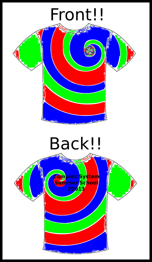
How is it we must limit ourselves to just two solid colors? I say no!! Let's purchase 62 white standard Santa Fe Institute shirts and tie-dye them!!
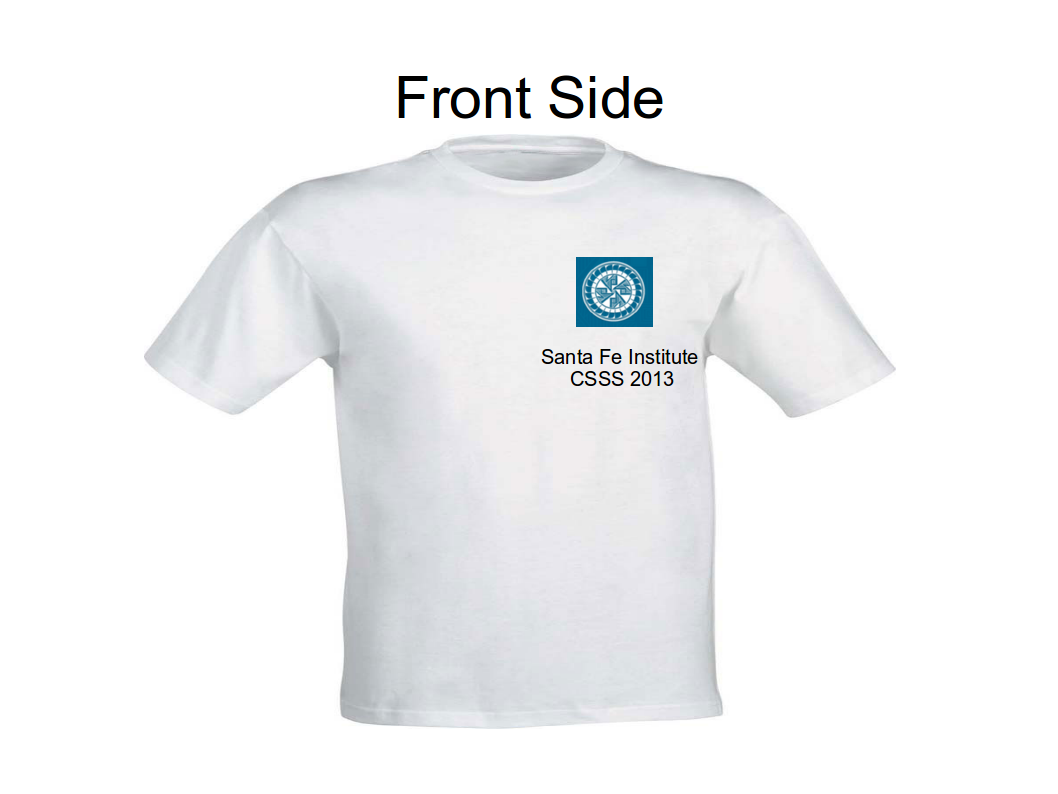
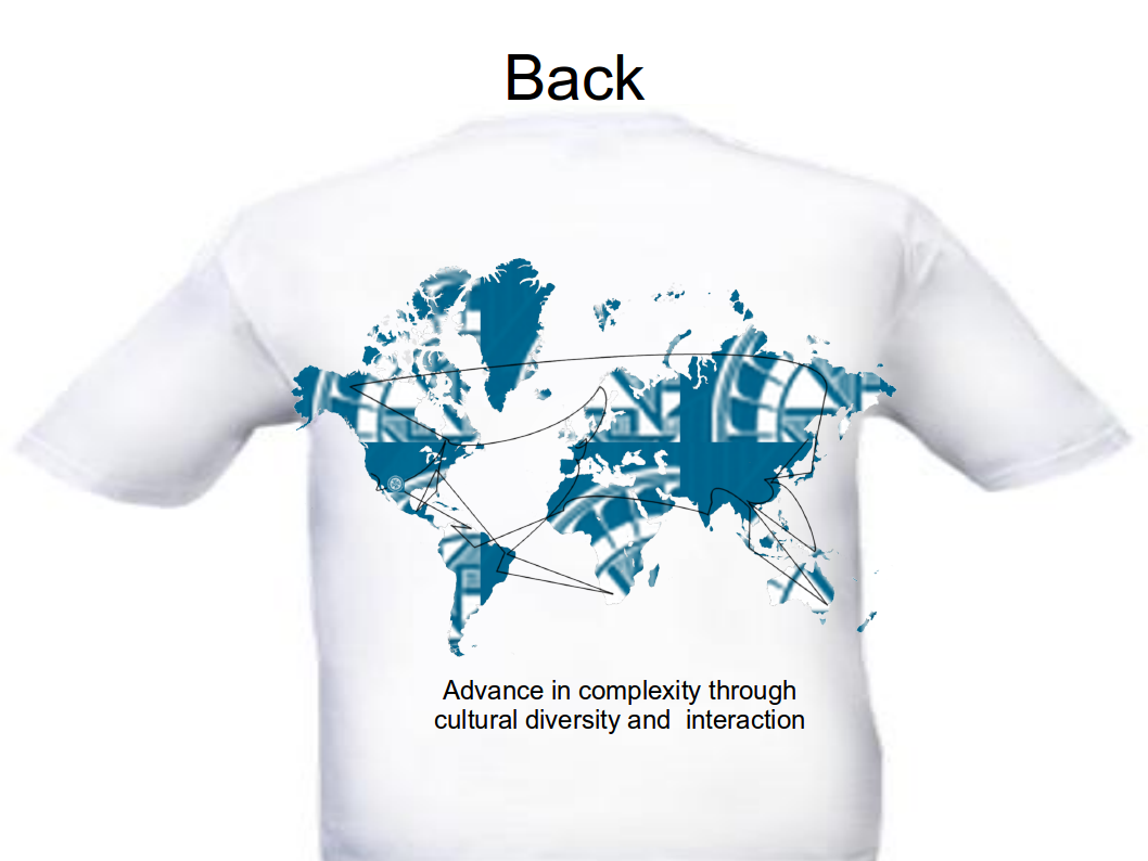
For the picture above I just picked real tie-dyed shirts and put the SFI logo in them. I figure out that the logo will not be in the center, but slightly at the left and a little bit higher. It is very easy to make our shirts have the focus of the spiral in there, or to use the SFI as the center of successive tie-dyed circles. I also propose to write in the back part a brief text to get us identified with the CSSS. A very schematic view in the following drawing:
Of course, each one chooses the pattern (s)he wishes. There are plenty of them! Before voting for this possibility beware that we will have to spend maybe a whole afternoon working on that, and that the results can be different from the expected... Tie-dye is a quite stochastic and stuff!!
Peace and love!! -- Luíño
s
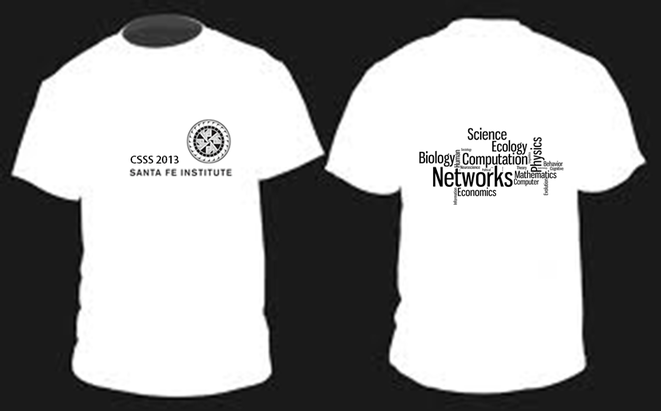
I made a wordcloud of our respective fields of study using Sanders statistics. I think the wordcloud could be combined with another design e.g. Manishs Poincarè pickle or Vanessas I <3 complexity. Also the wordcloud font & style can be changed.- Susanne
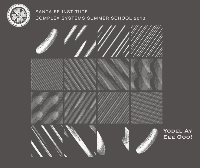
Never forget the yodelling pickle. Never.
--Manish
It`s great, good laugh! - Susanne
Updated the text on the header to include mention of CSSS. --Manish
Question: Should "Yo Delay" be moved to the back of the shirt? --Manish
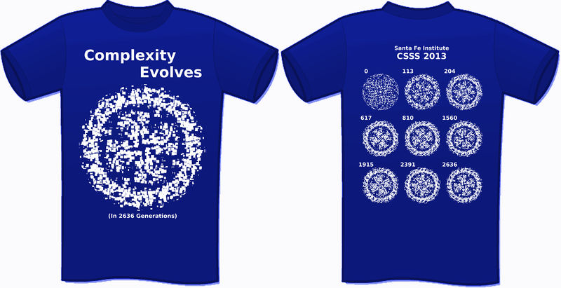
I thought it would be interesting to use something we learned in class for the T-shirt. I'm trying to use a genetic algorithm to evolve the SFI logo. On the back are population samples from various time steps.
(This is a work in progress, and I'll keep improving the GA/shirt up until the voting on tuesday. - Todd)
The landscape are the mountains behind St.Johns, and the mandelbrot fractals are the clouds. I can make the landscape less detailed and more simple, uploads will follow - Susanne
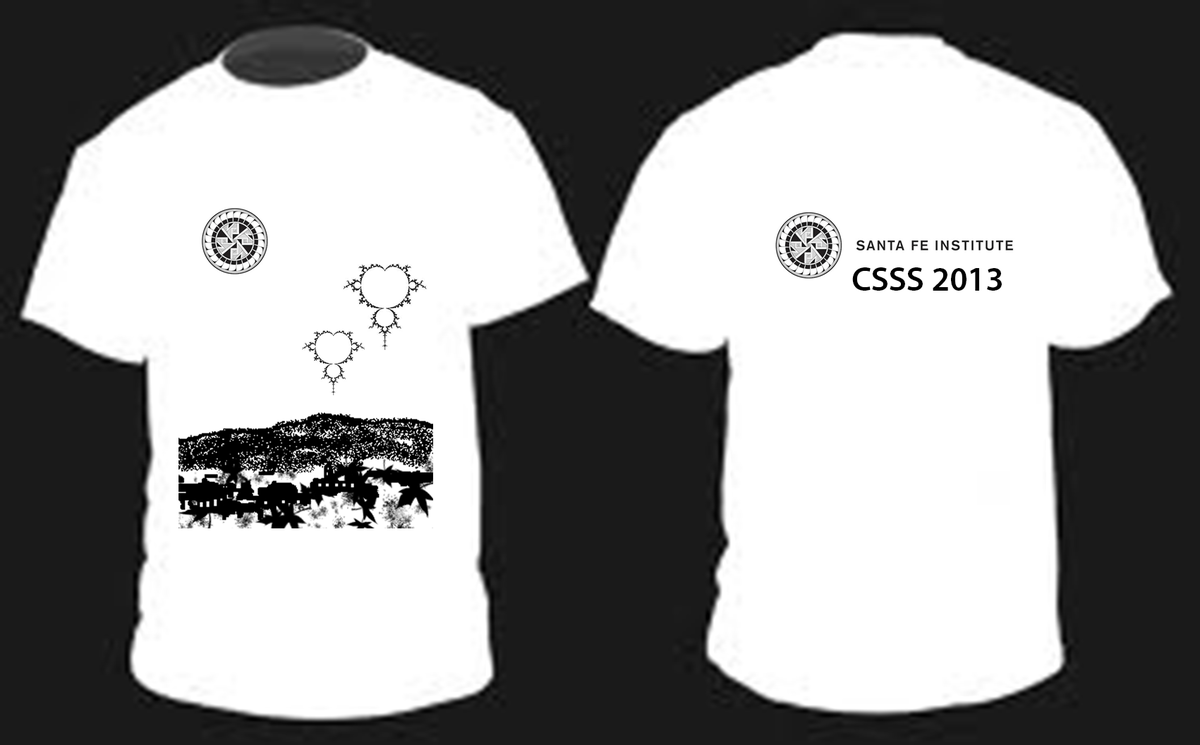
What do you think about this? -- Andrea
Two things:
- the color could (should) be different than simple white...maybe light gray
- the network on the back has to be carefully drawn since the idea is to have a node for each of us and place it where we come from/study. The edges can then be more or less randomly assigned to have a connected net ;-)
- Andrea, if you will revise the back drawing, kindly include Philippines =). This is a good design.=) Ren
- Andrea, it looks good! Could you kindly include Madrid (center of Spain)? Thanks! Regina
- Andrea, I like your design! Could you please include lebanon (east of the mediterenean)? thnx :) amara
Sure, thanks for the feedback. I will include the nodes where missing in the case it goes through the selection process, the current version is only a prototype ;-)
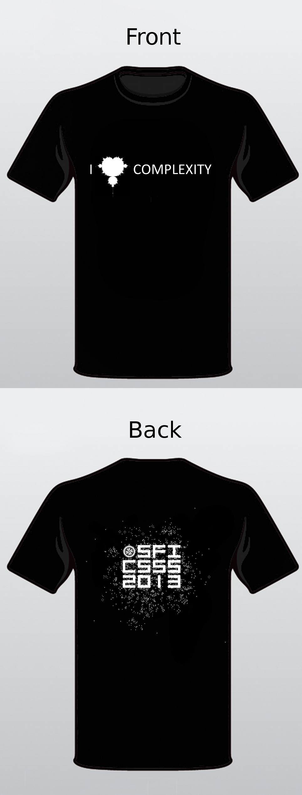
Here's a prototype, combining Vanessa's front, with my Game of Life back. The real one will either say SFI CSSS 2013, or I'll use the entire logo (with nice font).-- Nix
Really cool Nix, what about putting a reference to CSSS 2013, so that we/they remember this year? -- Andrea
Okay, I updated the shirt. The logo looks fuzzy in this version, but it will be slightly larger and crisper in the final. Nix
One final statement: The colors are negotiable, though I like light colors on black. Also, as I said before, I can load in text with a nice font, but I'll keep the "Pong" style font otherwise. The pixels could be made larger if you're concerned that it'll just look like a moldy shirt ;) -- Nix
Not sure of a design, but something with Phase Space Camp?
- I have created a cross words from all our names, so maybe we can print this on one sides of the T-shirt. you can find your name, let me know if i skipped any name :)-- Amara
My suggestion is actually inspired by Susanne's design with the Mandelbrot clouds. If lots of folks like it, perhaps this could be made into a bumper sticker? A plain Mandelbrot would also do; I just grabbed this one because the <3 is more obvious. -- Vanessa

Ha! this is great— I <3 the Edge of Chaos would be cool too. John D,
This one really clicked with me immediately. I was expecting more "complex" designs, but I really love how simple and to the point it is. I wonder if we could maybe collaborate? I'd like to maybe design the back like I described earlier. Basically something like "SFI CSSS 2013" and the SFI logo, with Conway's Game of Life growing from the letters and logo... Nix
I like it. It would be interesting to program GOLLY to print the letters, don't know if this is possible though—John D
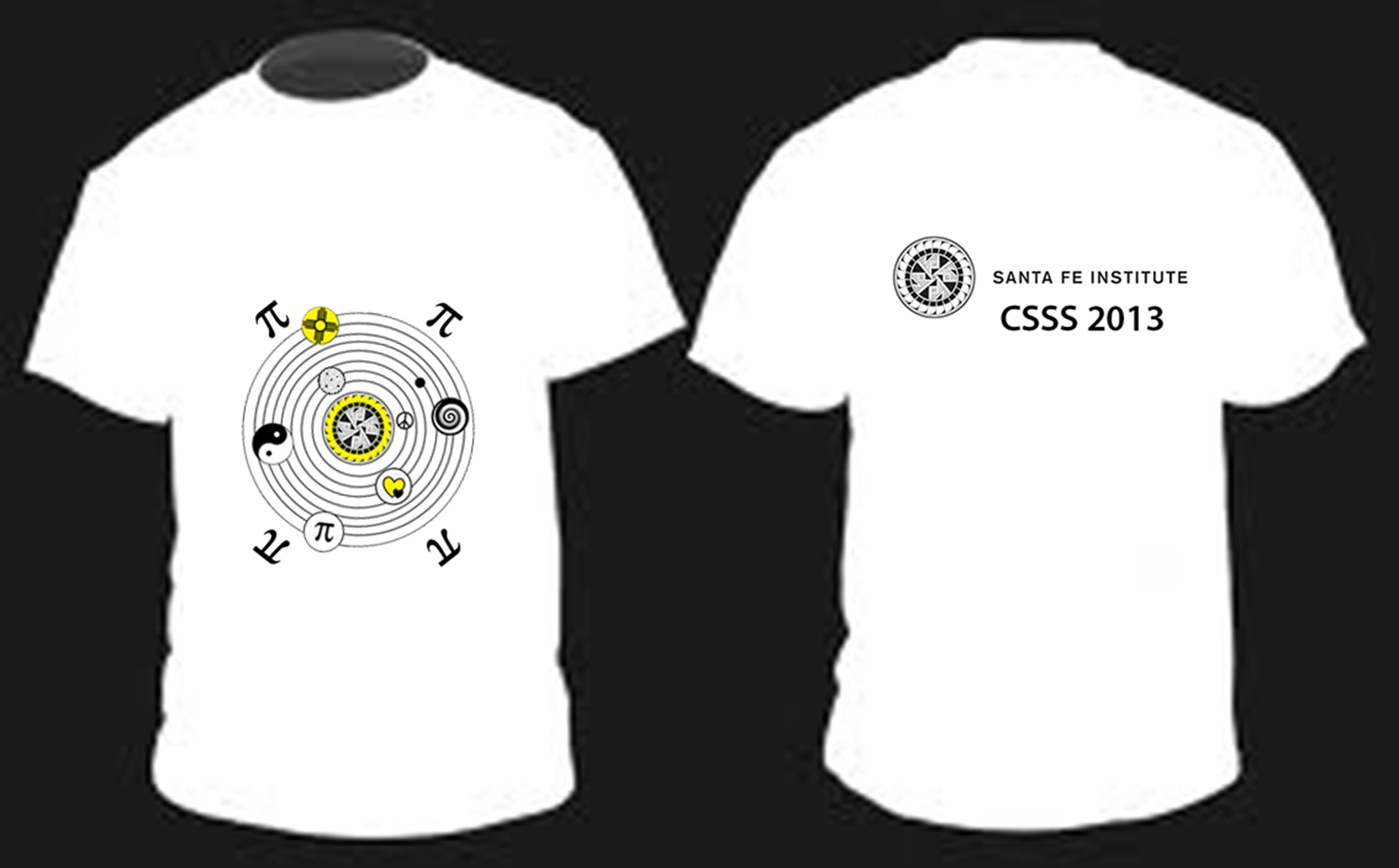
SFI solar system t-shirt. The color or symbols can be changed. If any of you have ideas for other symbols to put as planets, please let me know. I can also remove the pi symbols if this would look nicer. peace! :-) - Susanne
Chaotic warning t-shirt. -- Hua
Ideally I would like to have only the circular SFI logo on the shirt (instead of a sqaure). But I don't know how to get rid of the white background of the logo.

- This reminds me of the series of warning t-shirts that Despair, Inc. made a few years ago. I like the idea of a warning, but maybe we could make it more visually appealing? I'm not good with graphics, but the idea would be to have a clear warning symbol on the front of the shirt (a yellow triangle with symbol inside, like the example below) adapted to reflect chaotic systems (maybe the Lorenz butterfly?). I think the text could still say WARNING across the top, show the symbol, and perhaps CHAOTIC SYSTEM INSIDE across the bottom. The additional text, "Be careful with inputs," could be a second line on the bottom, or perhaps on the back. With this design, I recommend putting the SFI logo and CSSS 2013 on the back. -- Vanessa


